
OVERVIEW
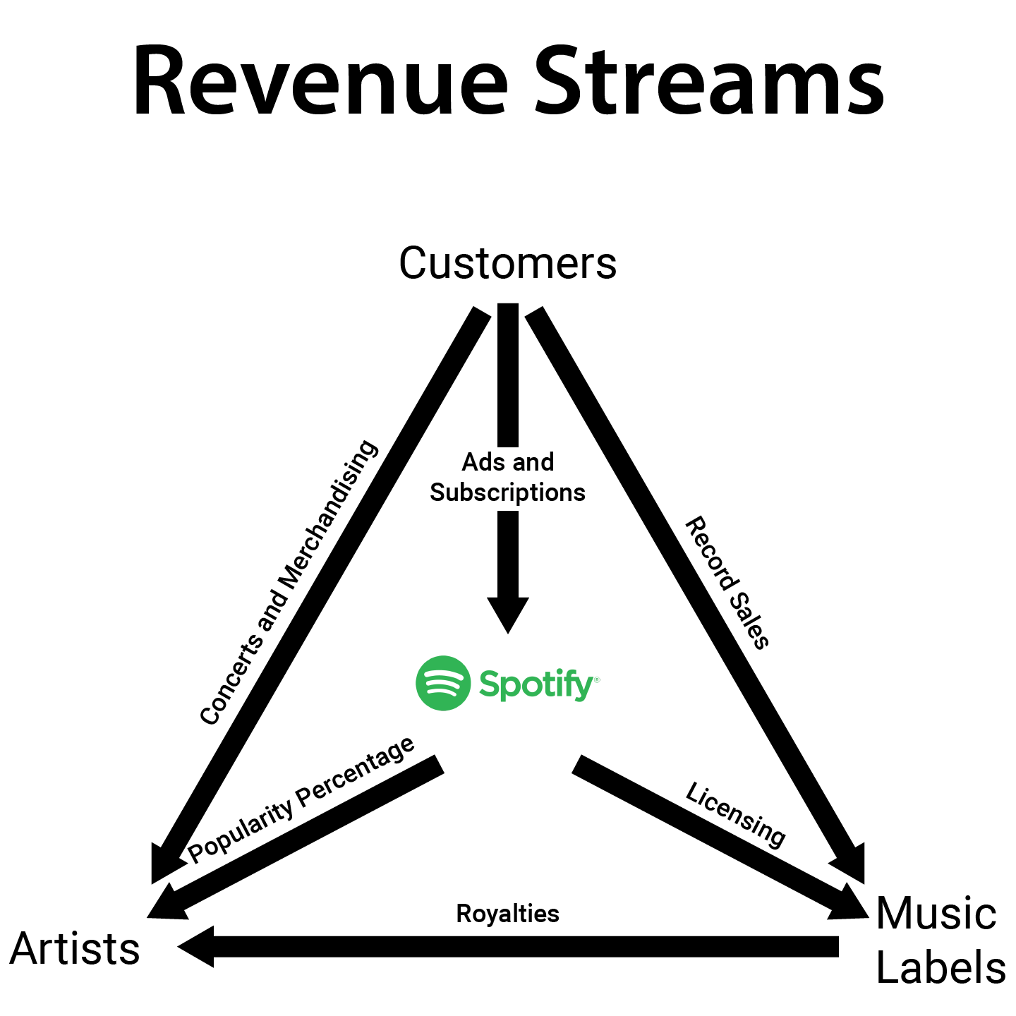
With the onset of the Internet, subscription based services have become an industry norm. Spotify was conceived as a way to combat digital piracy and still allow music companies to collect revenue for their artists, via subscriptions to their catalogs. Artists also benefit by earning money for each play, while simultaneously gaining exposure to an international audience, which can increase concern ticket sales. Additionally, subscribers benefit from discovering new artists and sharing them with their friends, via the platform's social aspect. Spotify, and other companies like them, have created a way to provide a win-win-win-win situation for recording labels, artists, consumers, and, ultimately, for themselves.
THE PROBLEM
One article reports that “A whopping 25% of Spotify’s 60 million active users are paying customers”. However, 3 in 4 still have yet to become part of the revenue stream. A decision was made to explore where those issues might lie, look for ways to rectify them, and submit change requests directly to Spotify.
RESEARCH
Discovery
An initial effort was made to learn as much about Spotify’s business model to understand their positioning within the marketplace.
All in all, Spotify aims for a broad market that is not based on age, gender, or other standard factors. Instead they focus on people who meet certain criteria as follows:
 https://spotifyforbrands.com/us/
In addition to researching the brand, I located a Spotify Marketing Plan assembled by a University of Texas Austin Business student Devon Carroll to gain additional insight into their corporate philosophies, goals, situational analysis, strengths and weaknesses, competitive landscape, target market, and revenue streams.
Specifically, two target markets were listed: teens and young professionals.
As an additional resource, I located the Spotify Community Boards, where I could learn more about technical issues that could be addressed.
Interviews & Personas
After reviewing the teen and young professional primary target markets seen in the marketing plan, I decided to add an outlying or secondary market to the mix, due to the fact that many teens rely on their parents or guardians to provide the financial resource to acquire Spotify's premium subscription.
I then conducted an interview for each target market to locate some end user pain points. The issues noted were then used to search for corroborating feedback in the Spotify Community Boards.
The individuals identified were:
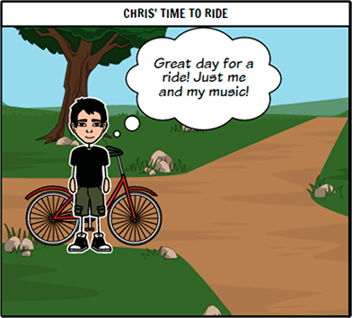
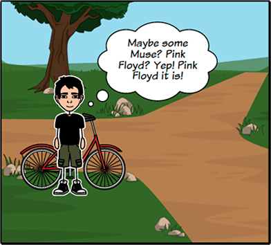
The Teen - Christian

“I really like listening to music while i’m on a bike ride, but ads kinda ruin it. Because I have the free version, I can’t hear what I want to listen to. It’s also a pain to move around in the player.”
Characteristics
- High school student
- Choir Student
- Social
Goals
- Graduate
- Discover new music
- Spend time with friends/girlfriend
Behaviors
- Spends time bike riding
- Discover new music
- Relax and enjoy music during study time
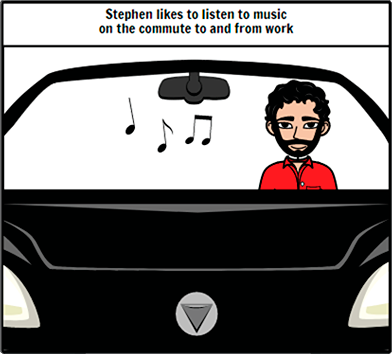
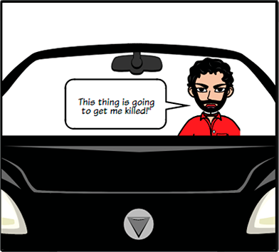
The Young Professional - Stephen

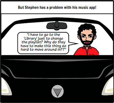
“While I’m driving, it’s a pain to try to switch to another playlist without having to go through a bunch of menus. It can make driving dangerous.”
Characteristics
- Tech Savvy
- Disposable cash
- Social
Goals
- Pursue his career goals
- Spend time with fiancee
- Hang out with his friends
Behaviors
- Spends time driving/travelling
- Works on musicianship
- Games with friends
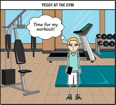
The Professional / Parent - Peggy

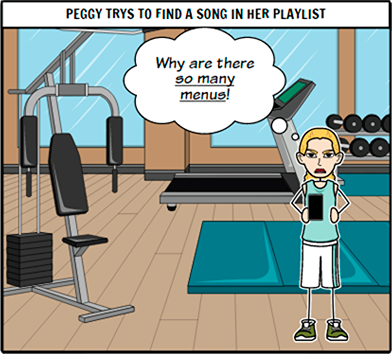
“I really enjoy listening to music, especially when working out. I also like sharing the music I listened to as kid with my children and learning what they like. But trying to find things in the list and managing my playlists can be frustrating, so I just let my son set it up for me.”
Characteristics
- Professional with purchasing power
- Has teenage children
- Commutes for work
Goals
- Treat PT patients in their homes
- Stay in shape
- Spend time with her family
Behaviors
- Listen to music while driving to appointments during work
- Works out while listening to music
- Listens to and shares music with her children
Pain Points and Journey Maps
Christian's chief pain point was related to the free service and ads.
Stephen's chief pain point was regarding the navigation of playlists.
Peggy's chief pain point was the difficulty of managing the playlists.
Focus
Playlist Navigation
While Christian's perspective regarding ads were valid, Spotify relies on ads to produce revenue due to their willingness to offere a free player. However, his mom, Peggy, was willing to purchase the premium subscription for him. A secondary complaint shared by him referred to issues with navigation, a sentiment also shared by Peggy.
Stephen's chief complaint related to the number of menus needed just to switch from one playlist to another, particularly while driving - another reference to issues with navigating the menus.
Playlist Management
Though Peggy had issues with navigation, her chief complaint stemed from the ability to manage playlists versus the play queue. She found it difficult to create playlists and add, remove, and reorder songs because the menus are confusing and located in different places.
Several postings on the Spotify Community Boards were located and confirmed that the two problems noted, navigation and playlist management, were a significant issue for many subscribers, as well.
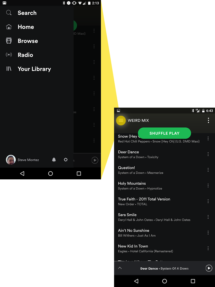
Heuristic Study of Spotify
My first step in crafting a solution was to examine the existing product, "AS-IS". I wanted to see where the break downs occurred with the interface before attempting to craft a solution.
Playlist Navigation
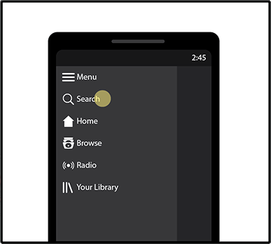
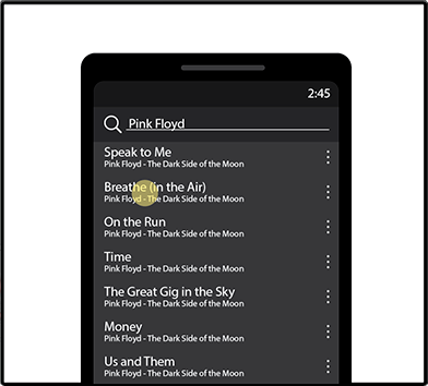
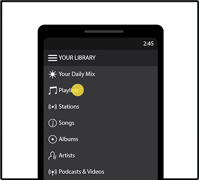
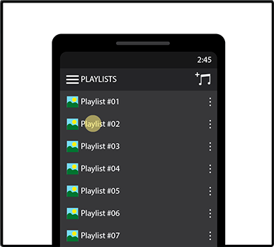
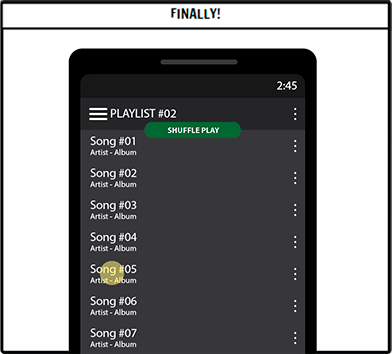
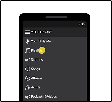
Upon launching Spotify the user is sent to the "Home Page" where the first row is a set of targeted recommendations curated "Just for You", while a second row invites you to "Jump Back In" to your existing mix of Albums, Artists, and Playlists. In order to locate a playlist you can:
 side scroll or click the menu,
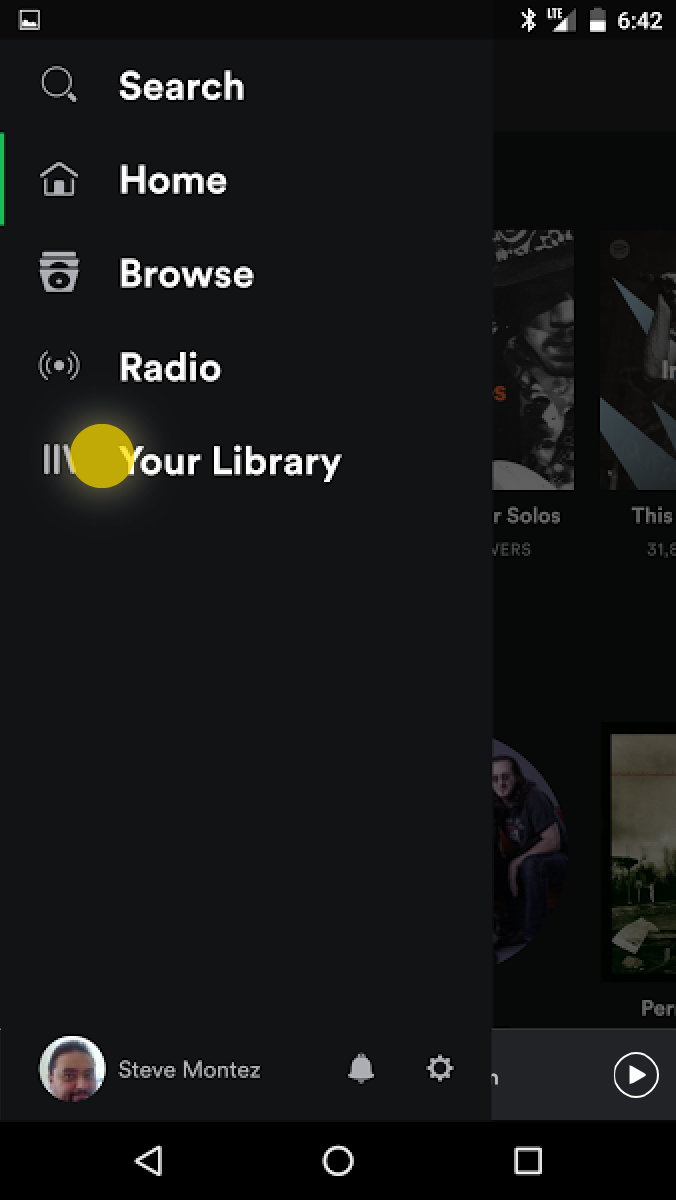 selecting Your Library from the list,
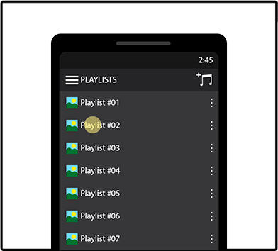
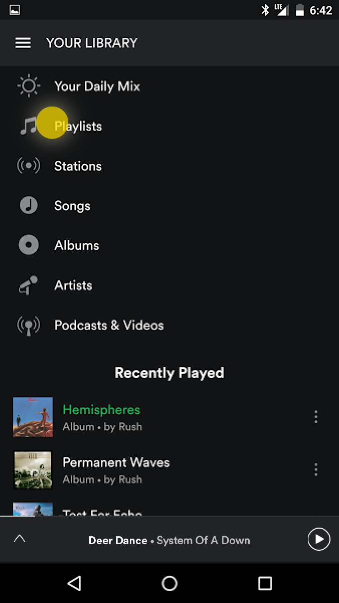 clicking on Playlists,
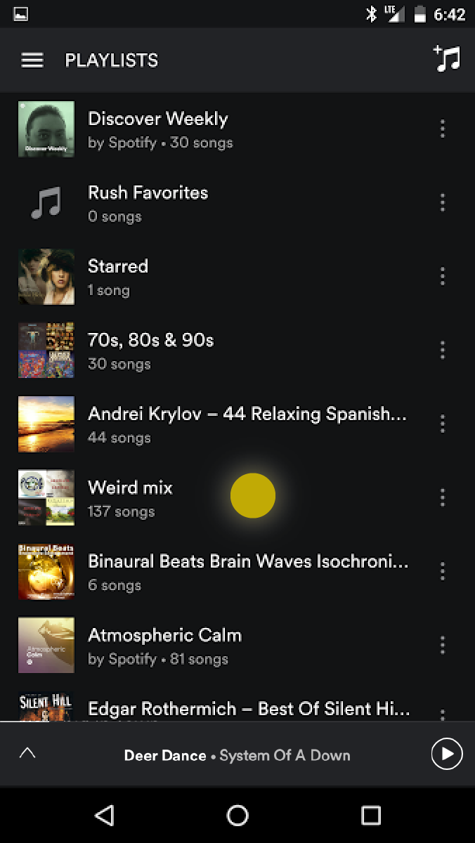 scroll and select a playlist,
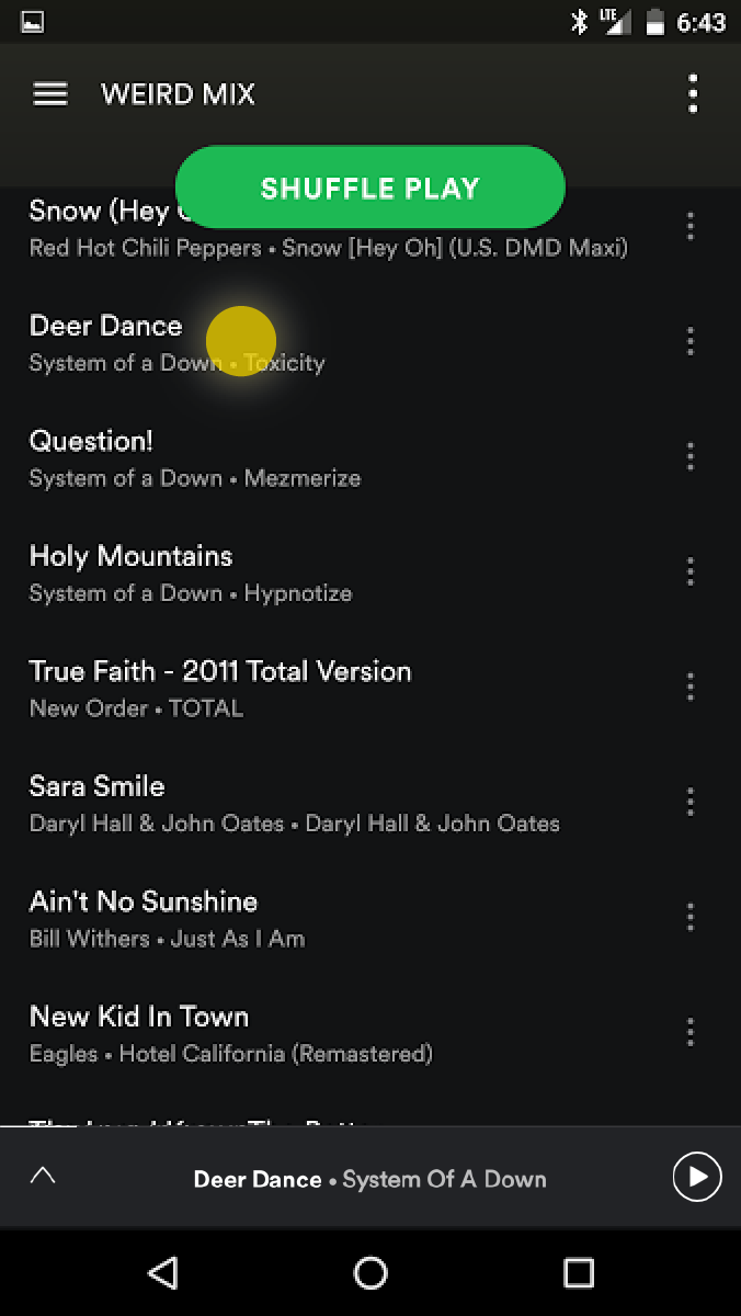 and if desired, select a specific song.
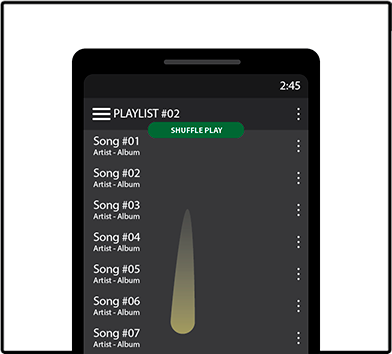
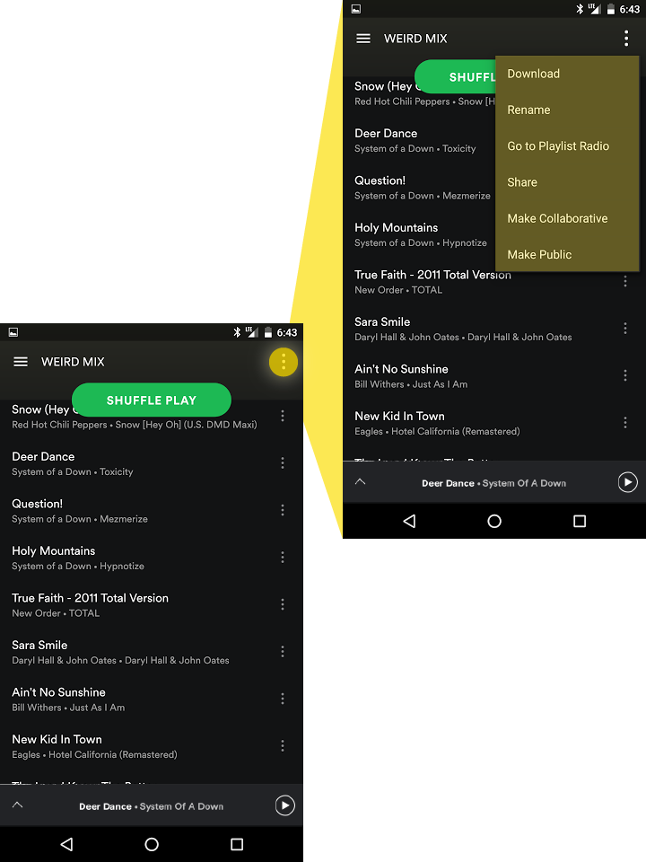
Playlist Management in the Player
Once you're in your playlist, there are no options to navigate to a different playlist without 3 to 4 steps of excise. A need to intently focus on the screen needlessly taxes the user. If you are currently in a playlist, you'll need to return to the menu or home screen, and follow the same steps again, as the active playlist offers no simple solution for switching lists, as:
Additionally, Peggy's complain regarding playlist management becomes apparent due the fact that functions to manage a playlist are not consolidated in a concise interface to bring controls to the playlist, but instead, are distributed to various locations on the app.
You'll need to go to your library to reach the playlists screen again.
The playlist menu on the right will open a menu of unrelated options. However, you can rename the playlist from this menu, but not edit it. The play queue can't be managed from this menu, though.
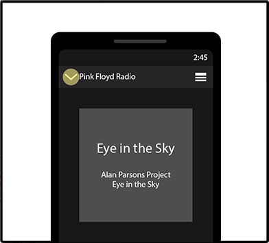
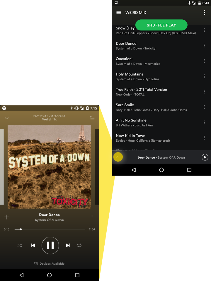
Full screen controls only help to control the current playback with options to shuffle, repeat, rewind or fast forward, jump back to the beginning of the current song, skip to the next one, pause the current song, or add the current song to another playlist. The play queue can be accessed on the full screen player with the upper right button.
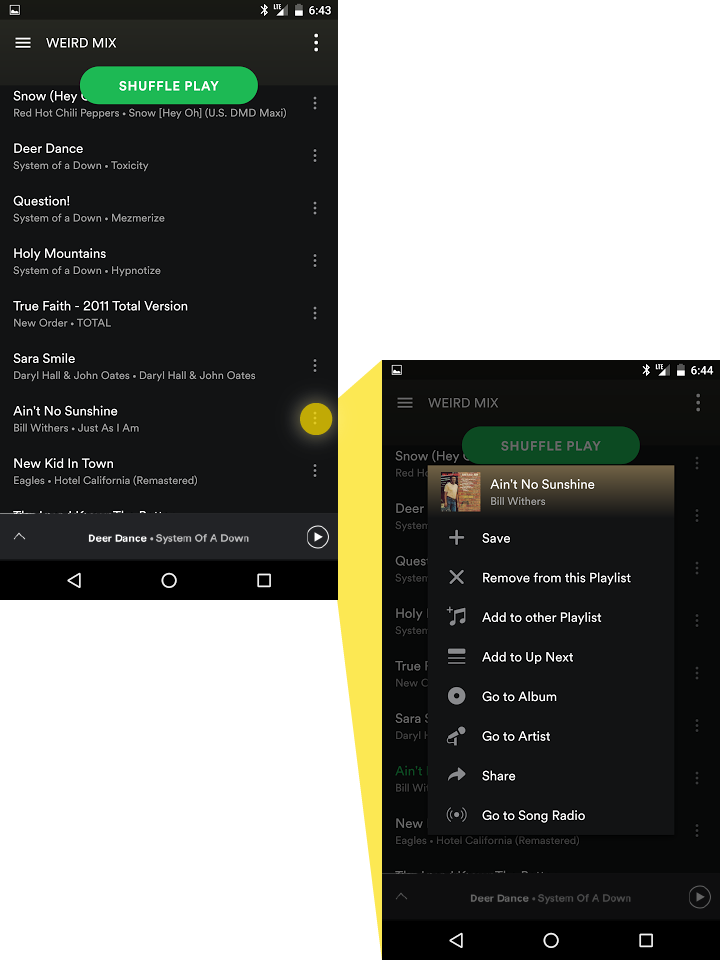
Each song also has a menu of options related to the adding and removal of a song from a specific playlist, but no options to reorder the list or add and delete multiple selections at once. However, there is no option to edit the entire playlist.
IDEATION
Sketches
With a clearer understanding of how the application currently functioned, I was able to proceed with some initial sketches to see if I could reduce or eliminate problems with the interface. I then sketched out a few ideas and looked for opportunities to remove excise from the final design before proceeding to wireframing.
Playlist Navigation / Switching
To solve the problem with quick navigation. I considered the idea of reorganizaing the Home page so that a personalized list of items would be available to play immediately to avoid lengthy menus.
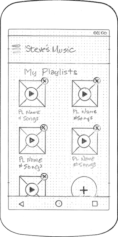 Home Screen
To solve the problem with quick navigation, I considered the idea of reorganizaing the Home page so that a personalized list of items would be available to play immediately to avoid lengthy menus. A dropdown option was also added by the playlist name to facilitate switching playlists during playback from the playlist or the full screen player, without having to return to the menu.
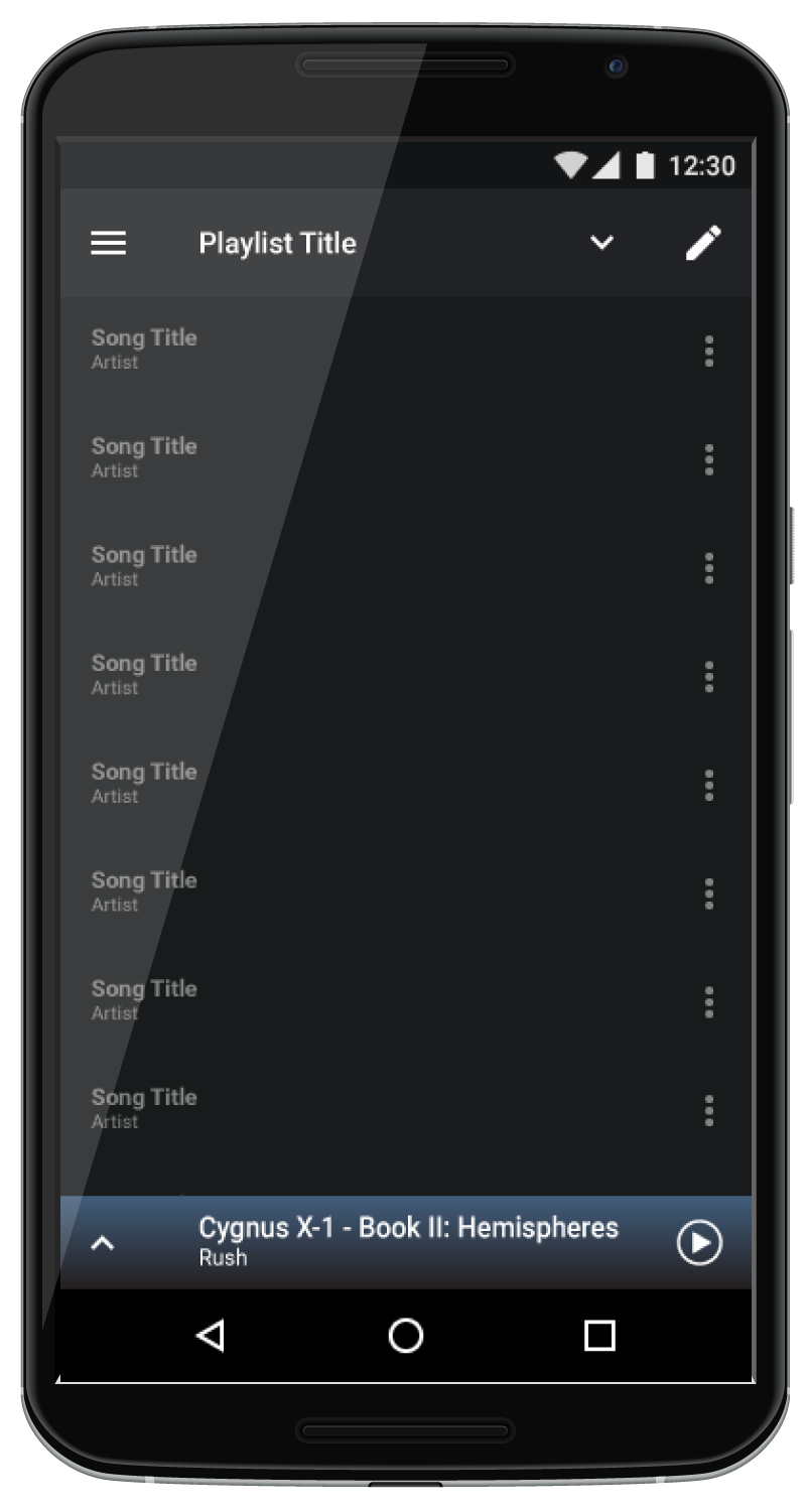
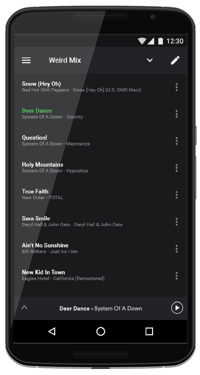
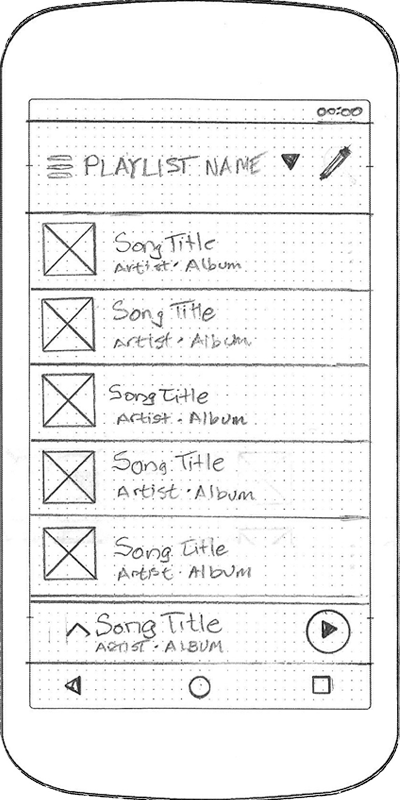 Playlist Screen
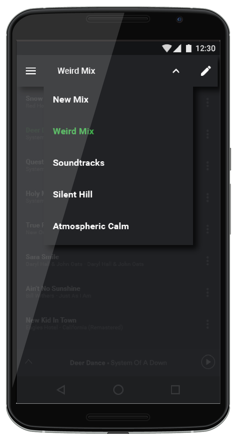
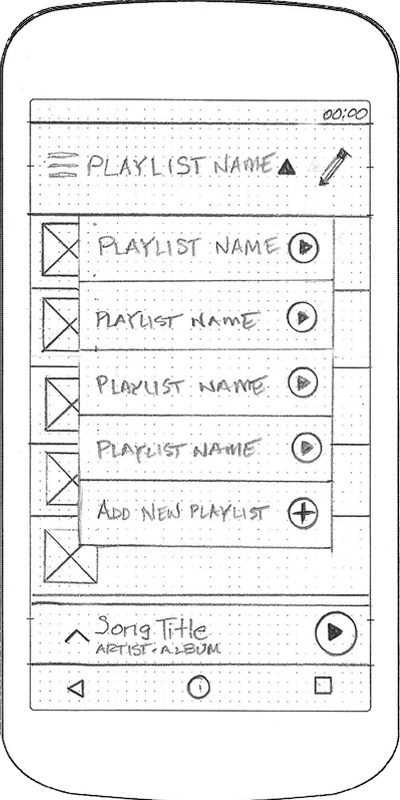 Playlist Screen with Dropdown
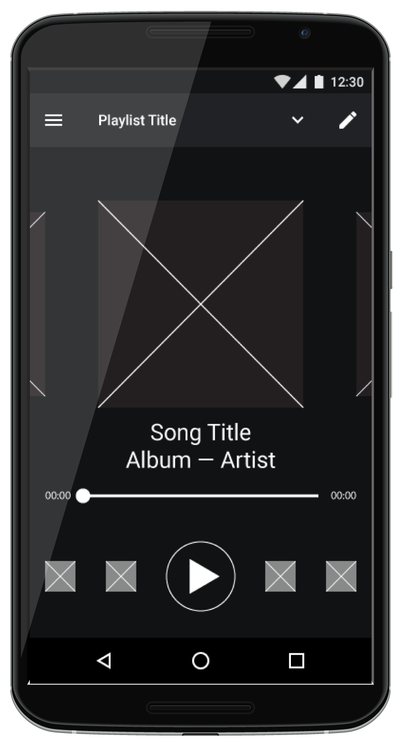
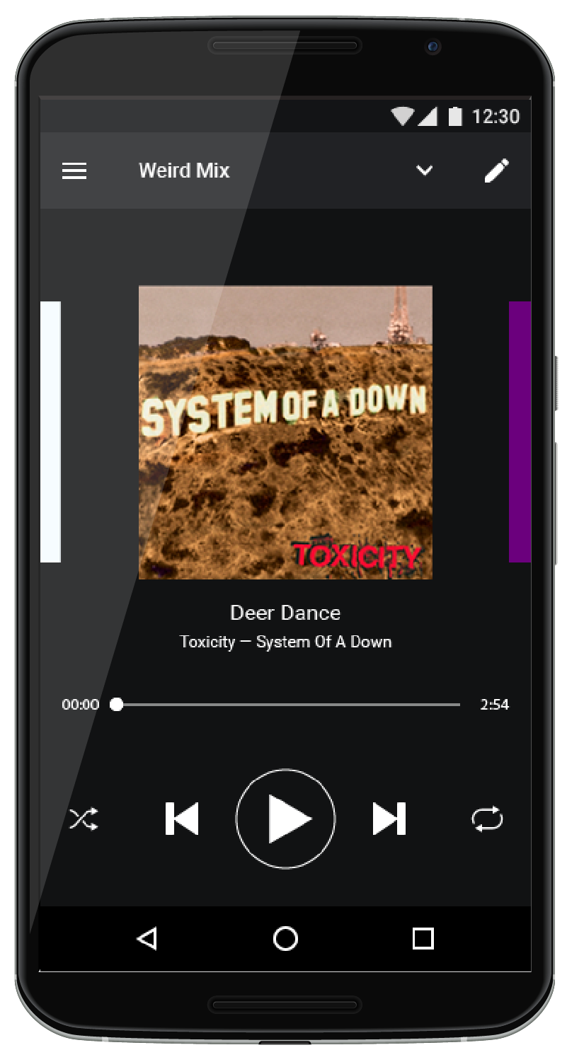
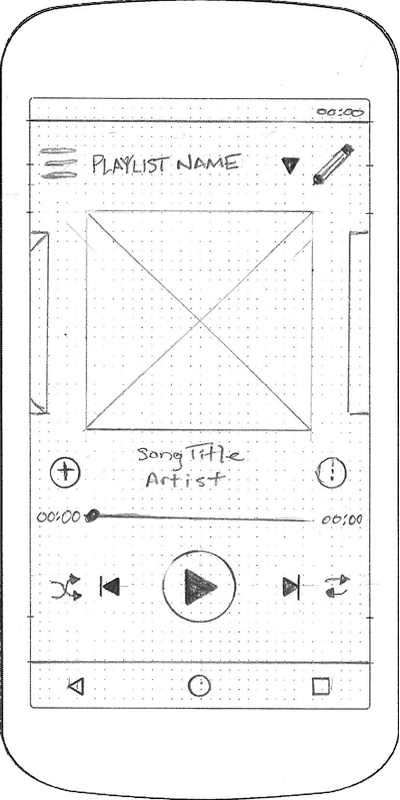 Full Screen Player
 Full Screen Player with Dropdown
Playlist Management
The home screen presented above, would allow for a long pretty to edit or delete a playlist. Playlist editing would also be available while in the playlist. There are options for adding and deleting songs, as well as the option to reorder the songs, and even rename the playlist, if desired.
 Playlist Editor
 Playlist Editing
Wireframing
Once sketches were complete, I created the new layouts in Illustrator.
Playlist Navigation / Switching
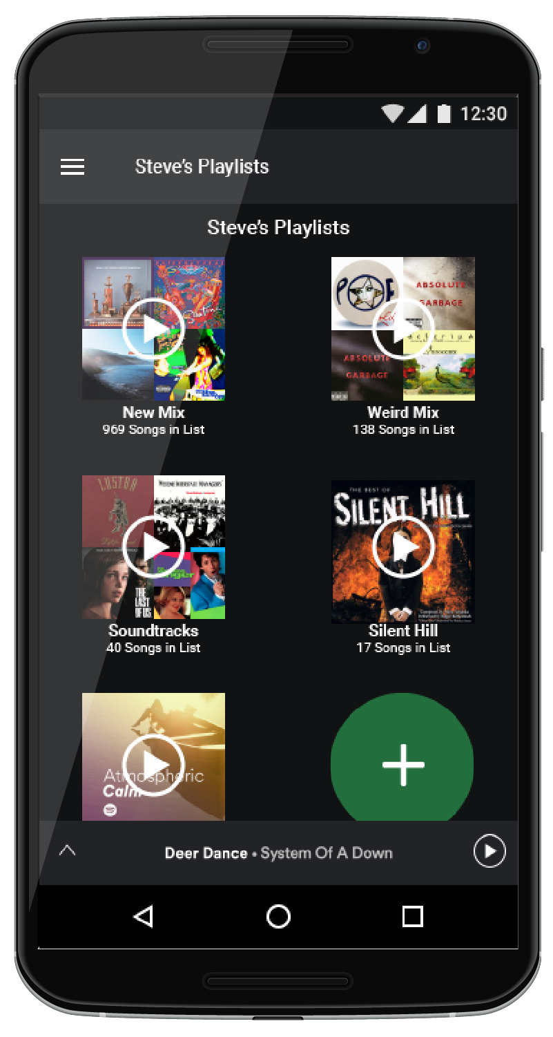
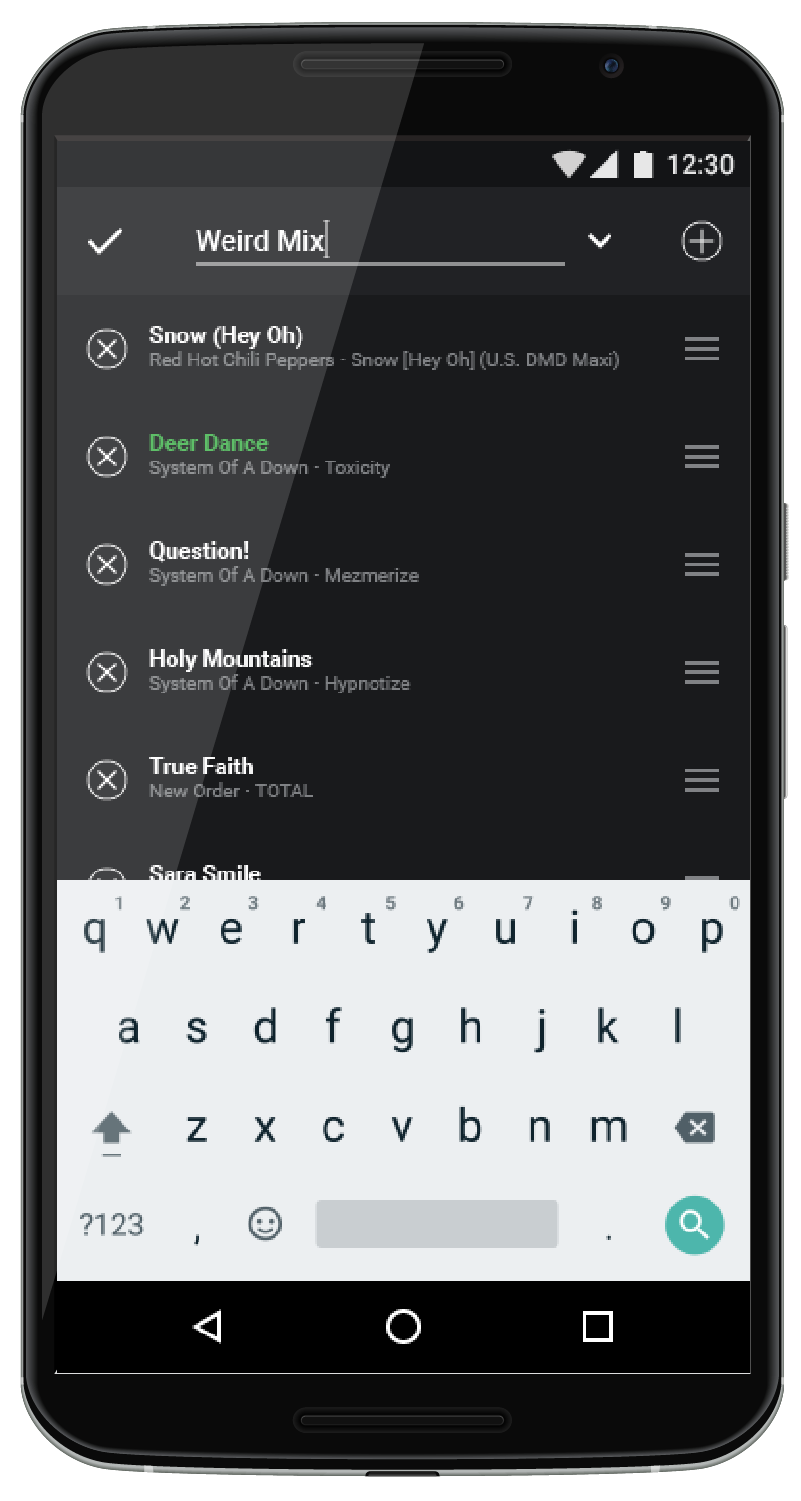
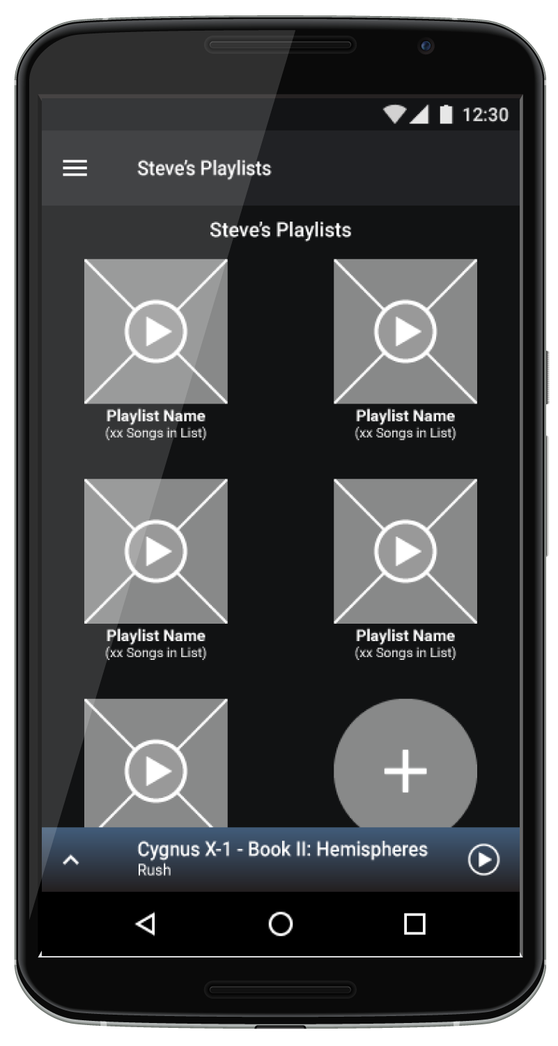 Tap to play / Long press to edit on the Home Screen
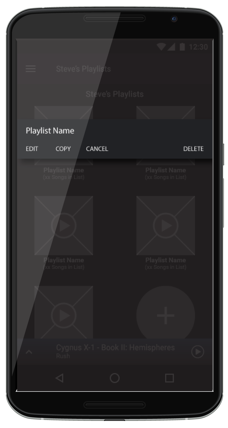 Edit or Delete Playlists from the Home Screen
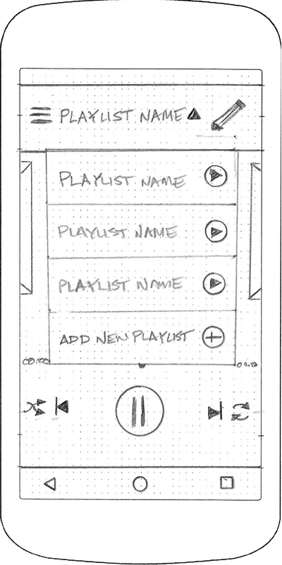
 Switch Playlists from the current playlist
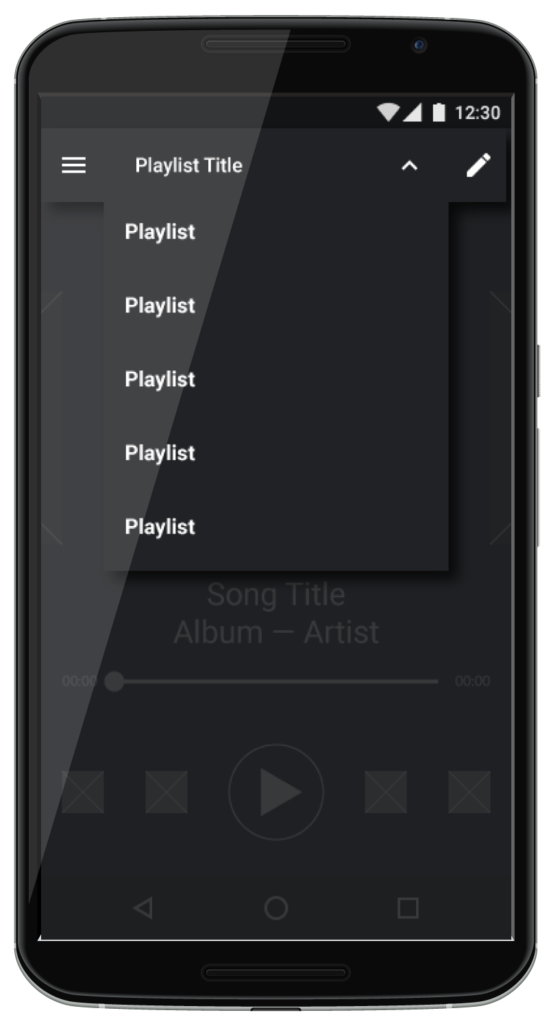
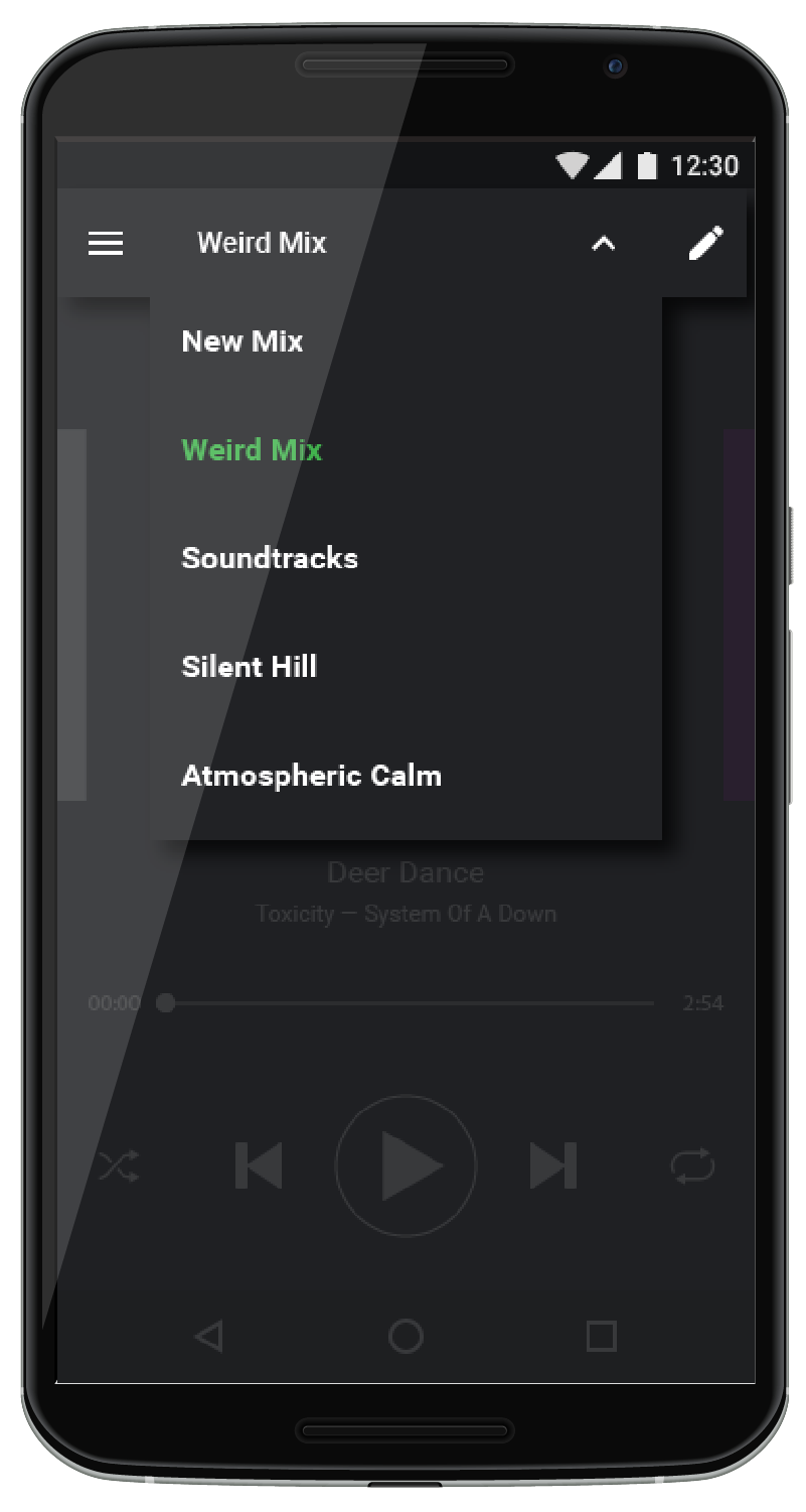
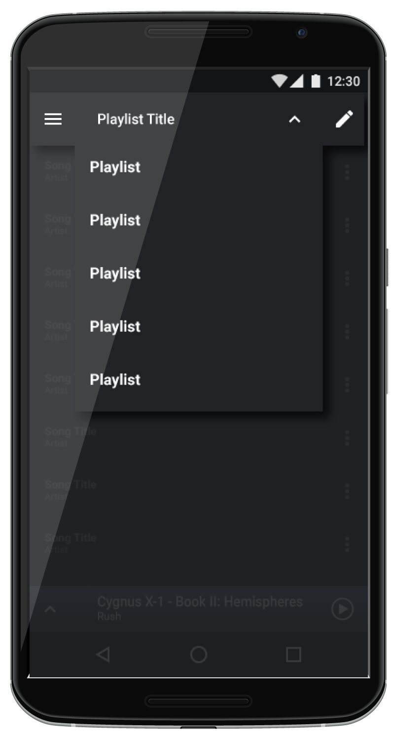 Playlist Dropdown
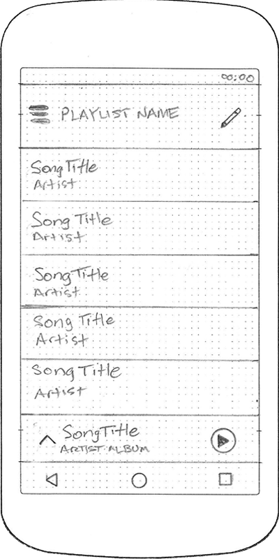
 Full Screen Player
 Full Screen Player Dropdown
To avoid too much excise, the solution for playlist navigation was two-fold. The Home screen would be modified to be able to display the content the user would want to see - in this case, the playlists. Within the playlist themselves, a dropdown would be incorporated to allow the user to display a list of playlists, and tap on one to switch. This option would be availble to both the Playlist player and the Full screen player.
Playlist Management
Tap to play / Long press to edit on the Home Screen
Edit or Delete Playlists from the Home Screen
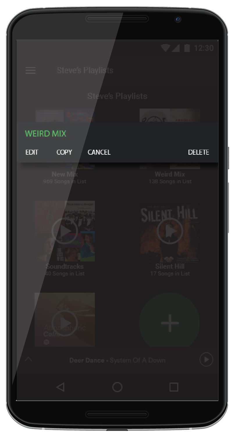
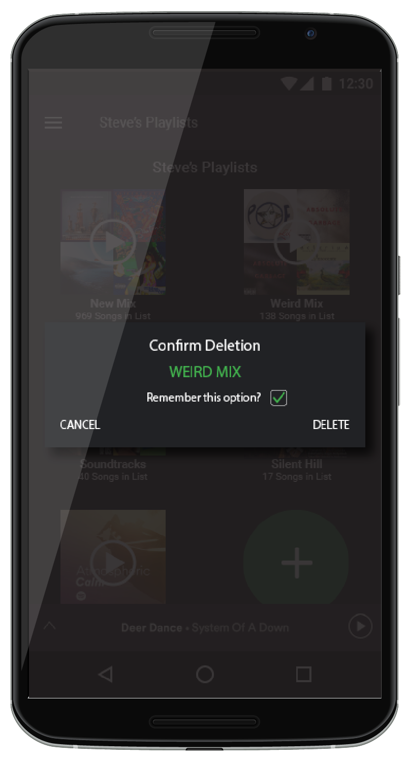
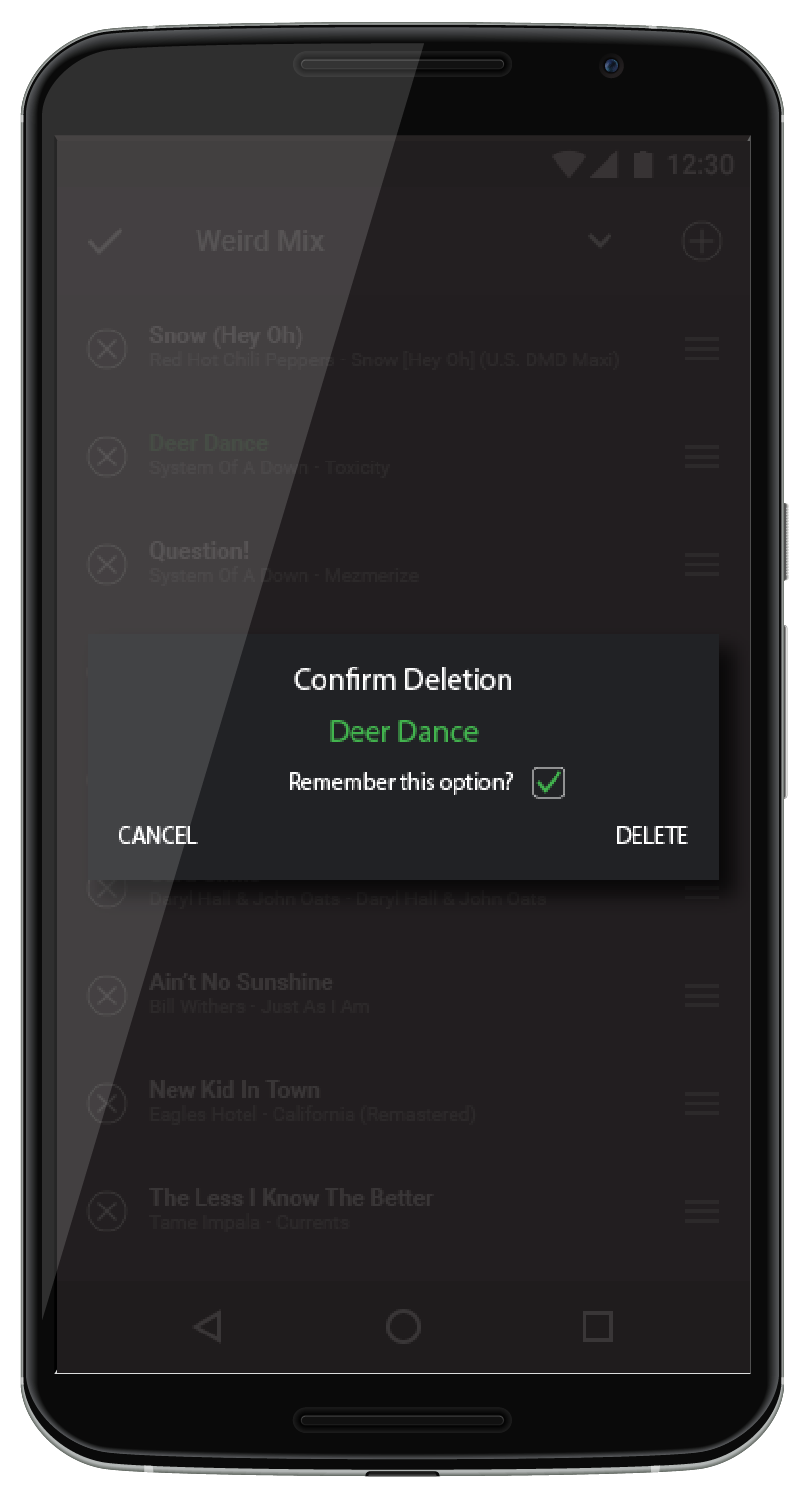
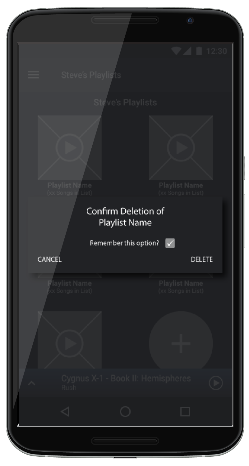 Efforts to confirm playlist deletions with an option to prevent excise
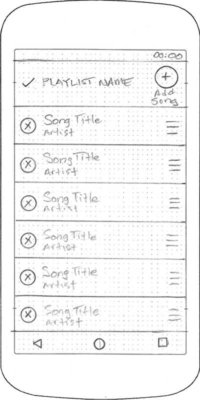
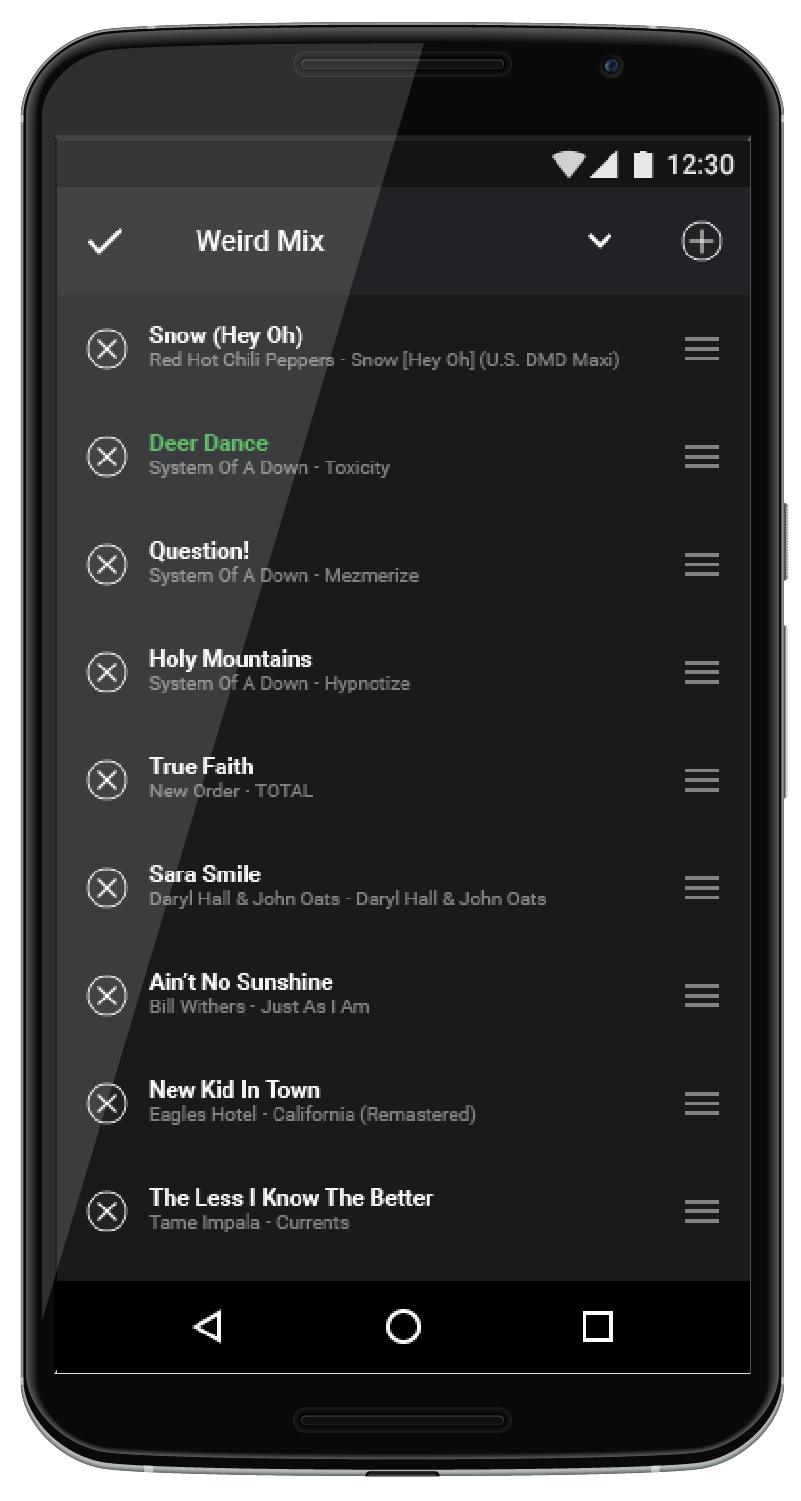
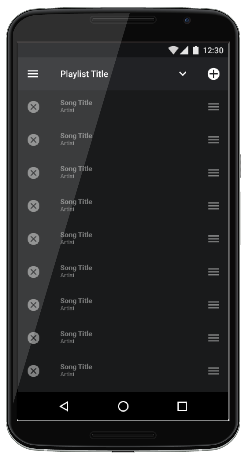 Add, remove, and reorder songs in your playlist
 Rename your playlists easily from an active playlist
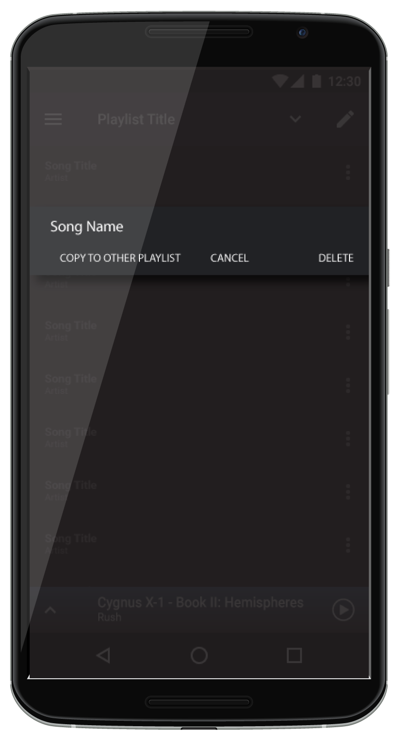 Song deletion confirmation
As with the playlist navigation, playlist management would be incorporated into both the Home screen and the Playlist itself. Long presses on the Home screen would allow a playlist to be copied, edited, and deleted. Deletions would initially be confirmed, but a simple option would allow future deletions without excise. The editor would allow the user to rename, add, delete, and reorder the playlist, as desired. Within the playlist itself, a common edit icon, the pencil, would be used to activate the editor, as well. Song deletions would intially be confirmed, but provide for the same confirmation opt-out, like playlist deletions.
Final Renders


Feedback
Upon completing the final renders, I ran a quick usability test with the target personas to get their feedback and see if their concerns had been addressed with the proposed design changes.
“Well, the ads, I understand can't really be gotten rid of. But the navigation seems easier to use. I really like the playlist management and the way you can switch between playlists.”
- Christian
“Yes! This would do it. I like that the playlists are right up front when Spotify first opens up! And switching playlists would be so much easier this way.
Don't think you could talk them into adding more classical music, do you?”
- Stephen
“It looks like the playlist will be easier to manage if it works like this. If you could add a feature that lets you position the song in the list by putting numbers next to them, that would be great...the thumb dragging is useful, but still makes things hard if the list is long.”
- Peggy
CONCLUSION
Spotify has an enormous base of users and 3 of 4 still don't subscribe to the premium service. While other factors may play a part, the playlist navigation and playlist management interfaces can trigger a lack of confidence in the product.
Whilie some issues are difficult for the end user to overcome, such as ads for the free Spotify version, in other cases it's simply a matter of usability. For some users, the use issue provides a potential safety risk while others see a level of complexity that is at best, unncessary, and at worst confusing and off putting, triggering a loss of application adoption and lost revenue.
With a few minor changes, it is possible to increase the profitability of Spotfy and provide the subscriber with an improved user experience.